
On Thursday 15 September 2016, a discussion took place during class about the reliability and credibility of a news source. One of the students argued that “When there are graphs based on statics, you could assume that the source is trustworthy”. The reasoning may a little bit simplistic, but not surprising. Idris, Jackson and Abrahart (2011) proved that the visualisation of data has more impact on the perceived credibility of information than the actual authority of the data source. Pete Warden, an experienced data scientist agrees:
“The wonderful thing about being a data scientist is that I get all of the credibility
of genuine science, with none of the irritating peer review or reproducibility worries …
I thought I was publishing an entertaining view of some data I’d extracted,
but it was treated like a scientific study”.
The illustration Warden uses is the Facebook friend network visualisation across the United states, which was extremely popular and even cited in the New York Times as evidence for growing social division. Although Warden clarifies in his article that the reasoning behind his network graph was perfectly solid, the clustering process was “produced by me squinting at all the lines, coloring in some areas that seemed more connected in a paint program, and picking silly names for the areas”.
It seems like the credibility of the visualisation of Warden was considered high, even though the visualisation was in fact intended as a “bit of fun”. This example is an important acknowledgement of a serious problem: the more visual appealing a data visualisation is, the more credibility it deserves. Even when the sources of the visualisation are not credible (Idris, Jackson and Abrahart, 2011).
The downside
The example of Warden seems quite harmless, but there are a lot of seriously misleading data visualisations that go unnoticed. Mostly because they are shown quickly on a screen, or because the reader is distracted by visual bells and whistles (Cairo, 2015). For example, December 2015, the White House announced: “Good news: America’s high school graduation rate has increased to an all-time high”. The announcement Twitter included the following ‘bar’chart:
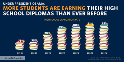
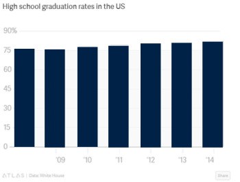
It seems like an appropriate graph, but the question is: what does it even mean that five books is equal to 75%, or that 16 books is equal to 82%? But even more important: this is a column chart, and column charts must always start the y-axis at zero (Cairo, 2015). Why? See it yourself, beneath the same data with an appropriate scale:
Another good example of this phenomena is the map of the results of the Scottish independence referendum per region. The green surfaces are against independence and the red surfaces support the independence of Scotland. As you might have noticed, the colors are already a bit misleading, because our instinct will associate red with negative and green with positive. However, looking at the following chart, what do you suppose? A result of 90 percent against, 80 percent against, or 70 percent against?

Actually, the result was 55 percent against, because the Scottish population is highly concentrated in geographically compact urban areas. It seems that we are used to think that how greater an area on a chart is, the more meaningful it is – which is, of course, not the case a for geographical representations.
The brightside
Rather than an essay against data visualisation, this blog should be read as a caution against blind acceptance. Because besides misleading data visualisations, there are hundreds of reliable visualisations which bring data alive that could otherwise take hours to unpick; since human beings consume information faster when it is expressed in diagrams or graphs than when it is presented as text (Verner, Wainwright and Schoenefeld,1997).
Nonetheless, it is always important to ask yourself the question: when is a visualisation credible? Unfortunately, there is no pat answer for this question. In some cases authors present their work as credible even in cases where the author may have taken some liberties in preparing the graphic (Hullman and Diakopoulos, 2011). In the future, authors should be forced to explicitly state on the bottom of a graph or illustration if it contains ‘predictions’ or other limitations. Until then, be critical!
References
Cairo, A. (2015). Graphics lies, misleading visuals: Reflections on the challenges and pitfalls of evidence-driven visual communication. In D. Bihanic (Ed.), New challenges for data design (pp. 103-116). Springer-Verlag, London.
Hullman, J. & Diakopoulos, N. (2011). Visualization rhetoric: Framing effects in narrative visualization. IEEE Transactions on visualization and computer graphics, 17 (12), 2231-2240.
Idris, Nurul Hawani and Jackson, Mike J. and Abrahart, Robert J (2011) map mash-ups: what looks good must be good? in: gisruk conference 2011, 27-29 april 2011, portsmouth. htp://eprints.utm.my/12576/1/NurulHawaniIdris_GISRUK.pdf
Verner, O. V., Wainwright, R. L., & Schoenefeld, D. A. (1997). Placing Text Labels on Maps and Diagrams using Genetic Algorithms with Masking. INFORMS Journal On Computing, 9(3), 266-275. doi:10.1287/ijoc.9.3.266

Very clear blog post Marijke. It’s striking to see that even big news channels use graphs or in this case a bar chart which is completely wrong visualized. I agree with you that we as consumers should be critical towards data visualizations, as long as journalists or data scientists can manipulate these visualizations to their own preferences. It’s a very bright lesson I’ve learned from this weeks classes. Never automatically consider something to be true, but take a good look at the details, for instance the scales of the axis. I agree with your statement that authors should be forced to explicitly state on the bottom of a graph or illustration if it contains ‘predictions’ or other limitations. This would be a first step towards reliable and credible data visualizations.
LikeLike
I wrote this whole reply and then something went wrong… so you might now have to responses from me,..
I liked you opening sentence and the rest of your blog made sense as well. I was particularly struck your first example, since it made me realize that apparently, if something looks nice and (although you argue agaisnt this) the author is credible, something is automaically perceived as true. At least by some people.
I think the same issues applies here as with any journalistic content: the reader is supposed and taught to be critical, fact-check and at least keep an eye out for any possible mistakes or untruths in the article. However, my opinion is that the author has the first and foremost responsibility to make sure that his facts are correct and to keep in mind any possible misinterpretations the read might have, and anticipate these. Therefore I agree with your statement, because the way I see it the same applies to visual representations.
LikeLike
It is indeed important that a designer puts limitations under their infographic, or state that there are predictions. During my preparation for my presentation this week, I learned that visualizations are very limited and we don’t get the chance to check everything. It would really look good on the designer’s part if they were confident enough to put in what might not be so clear about the infographic, or what might be misleading. If they don’t, it will look like they are purposely trying to mislead.
LikeLike
Interesting examples! It indeed makes me think: I used to believe statistics whenever I saw them, but after class and the presentations (and your blog) I will think twice.
I also agree with you that it would be a good idea to force visualizers to state what could be wrong with the visualization. Though, I think you’ll have a hard time making sure this is done. And, of course, as with the fact-checking you’ll come across the question: does this also go for entertainment graphs?
Then again, I think the same counts as for fact-checking: as a reader you should be critical what you see. As you showed, even by checking on the axis you might see if there is something wrong.
LikeLike
After the lecture and the examples you cited in this blog post, I’ll be more critical about sources and graphics. What I conclude now is that design techniques in infographics play a huge role in how we understand the information. Our mind can be fooled so easily that we need to keep alert every time we look at a chart. Another good example of misleading visualization is the electoral map US citizens and media use to show who the favorite candidate in each state is. I agree with you about designers and journalists writing next to the graphic comments about the data.
LikeLike
I like the example of Warden – it really shows the fundamental difference between science and journalism, as well as the credibility, transparency and trustworthiness that somehow inherently accompanies data visualisations in the eye of readers. I completely agree journalists should be more explicit about their research process and the limitations of their visualisation, only who is going to enforce that? The editors should take on that job I believe, but there still won’t be any forcing in the legal sense. It’s not forbidden to exercise misleading journalism, not to sloppily copy poplar visitations such as Warden’s without critically reflecting on it, and never will be. So there’s really no way out of this problem.
LikeLike
Nice blog! I agree that it might be a good idea to create some sort of law that forces journalists to put a side note underneath their graphs to inform their readers that the representation of the findings might not be 100% factual. However, who would check something like this? I think when we decide to create such a law, still a lot of journalists would create graphs that show misleading visualizations, for the simple reason that there is not time to check all these graphs. I think the best solution is to always think critically as a reader.
LikeLike
Interesting blog! I think you are right, we do need creators of visuals to add limitations to their work. I think it is hard to disagree on that. In practice I think it is difficult, because when I wrote my own blog on this topic I discovered that misleading in visuals is not only done unconsiously, but also deliberately. People who mislead others on purpose might not want to add limitations to their lies. But still, your view on how things should be done is nice! 🙂
LikeLike
As you have shown, there are many ways for a visualization to go wrong. I think visualizations should always be accompanied by some text which explains the data and the way it has been treated. I disagree with the analysis of one of the examples you showed, specifically the one where the Y axis starts at 75 regarding students earning high school diplomas. I think that without reducing the Y axis, it would not be possible to show the increasing trend as it is quite marginal. Thus, as long as the data and axis are properly labelled, I do believe that this is a valid option in some cases.
LikeLike